Köppen’s 1884 Isotherm Map Still Governs How Climate Zones Get Drawn
In 1884, a German botanist named Wladimir Köppen published a hand-drawn map of the world's thermal zones. That map, with its sweeping lines separating tropical, temperate, and polar climates, has proven remarkably durable. More than 140 years later, it still shapes how scientists, planners, and policymakers define climate regions. Its boundaries were based on monthly temperature means, not on observed vegetation or modern satellite data. Yet those lines persist in textbooks, agricultural models, and international climate reports. This article unpacks the craft behind Köppen's map, its limitations, and why a 19th-century template still governs a field that has moved far beyond its original data.
A Map Drawn in 1884 Still Decides Where Climate Ends and Begins
Köppen's map was an attempt to impose order on the chaotic variety of global climates. He divided the world into five main groups, labeled A through E, based on temperature thresholds. Tropical climates (A) had every month above 18°C; polar climates (E) had no month above 10°C. In between, temperate (C) and continental (D) climates were separated by the temperature of the coldest month. These thresholds were not derived from ecological data but from practical considerations, often tied to plant growth or human comfort.
The map's influence is hard to overstate. It appears in school atlases, university lectures, and climate atlases used by agricultural agencies. The Köppen system, often with later modifications, is the default language for describing climate zones. When a report says a region is "Cfa" or "BWh," it is using Köppen's shorthand. That shorthand carries assumptions about temperature and precipitation that were fixed in the late 19th century.
Yet modern climate data often contradicts these lines. Satellite observations show that vegetation boundaries, which Köppen's map was meant to approximate, have shifted. In many regions, the actual temperature and precipitation patterns no longer match the zone labels. For example, parts of the Mediterranean have experienced more frequent droughts, pushing them toward arid classifications, while some high-latitude regions are warming faster than the original thresholds assumed.
Despite this mismatch, forecasts, agricultural planning, and policy documents still lean on this old grid. The Intergovernmental Panel on Climate Change (IPCC) reports often reference Köppen zones when discussing impacts on ecosystems and agriculture. The reason is not accuracy but continuity. Changing the system would break comparisons with decades of past research, a cost that many scientists are unwilling to pay.
How Köppen's Craft Turned Temperature Lines into Zones
Köppen was not a climatologist by training; he was a botanist. His interest in plant geography led him to seek a climate classification that could explain vegetation patterns. In the 1880s, weather station data was sparse, particularly outside Europe and North America. Köppen relied on a few hundred stations, many concentrated in populated areas, leaving vast regions like central Africa and the Amazon basin nearly blank.
He used monthly means, not extremes, to define his zones. This choice was practical: monthly averages were easier to obtain than daily extremes, and they smoothed out short-term variability. But it also meant that a region with a brief cold snap could still be classified as tropical if the monthly mean stayed above 18°C. Extremes, which matter for many plants and animals, were ignored.
The scheme mixed temperature and precipitation in verbal rules, not mathematical formulas. For example, a climate was classified as "dry" if precipitation was less than a threshold that depended on annual temperature. These rules were written in prose, making them easy to apply but also ambiguous. Different researchers could interpret them slightly differently, leading to inconsistencies.
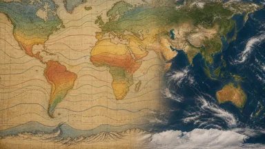
Köppen's 1884 map was a hand-drawn diagram, not a statistical model. He traced isotherms across continents, interpolating between sparse data points. The result was a smooth, plausible-looking map that masked the uncertainty underneath. Later revisions, particularly by Rudolf Geiger in the mid-20th century, refined the boundaries and added precipitation criteria, but the core thresholds remained essentially unchanged.
What the Isotherms Hide: Precipitation's Awkward Role
In Köppen's system, temperature is the primary driver; precipitation plays a secondary, modifying role. The five main groups are defined by temperature alone. Precipitation only distinguishes sub-types within those groups, such as "tropical rainforest" (Af) versus "tropical savanna" (Aw). This design choice reflected Köppen's botanical background, but it created problems in regions where water, not heat, limits life.
Aridity indices were added later to better capture dryness, but the core remained thermal. The result is that monsoon regions fit poorly. In South Asia, for example, the seasonal reversal of winds brings dramatic wet and dry periods. Köppen's rules, based on annual means, often misclassify these areas. Ad hoc adjustments, such as the "monsoon" sub-type (Am), were added to patch the problem, but the underlying framework was never designed for such variability.
The scheme's simplicity appealed to early geographers. It was easy to teach, easy to map, and easy to compare across regions. But real boundaries blur where temperature and rain interact. A semi-arid region might be classified as arid in a dry year and as humid in a wet one, depending on the data used. Köppen's static lines cannot capture this dynamism.
Critics argue that the classification is too crude for many applications. For agriculture, a zone label like "Cfa" tells you little about frost risk, growing season length, or soil moisture. Those factors, which depend on daily or weekly data, are more relevant than the annual averages that define the zones. Yet many crop models still use Köppen zones as a starting point, forcing local data into a 19th-century template.
The Map That Outlived Its Data: From Sparse Stations to Satellites
When Köppen drew his map, he had access to perhaps a few hundred weather stations, mostly in Europe and North America. Today, satellites cover every square kilometer of the planet, and reanalysis datasets combine observations with models to produce global grids at high resolution. The contrast is stark: a map based on sparse, uneven data versus a continuous, near-complete view of the Earth's climate.
Modern reanalysis data show that climate boundaries are not fixed. They shift with natural variability and anthropogenic warming. For example, the boundary between temperate and continental climates in the Northern Hemisphere has moved northward in recent decades, as winter temperatures have risen. Some studies suggest that the area classified as "D" (continental) has shrunk, while "C" (temperate) has expanded.
Yet classification systems still output zones in Köppen's letters. Even when scientists use modern data to draw the lines, they often keep the same thresholds, producing maps that look similar to the 1884 original. The result is a growing gap between data density and template rigidity. The map is no longer limited by data, but by the framework itself.
This persistence is not entirely irrational. The Köppen system provides a common language that facilitates communication across disciplines. A biologist in Brazil and a climatologist in Germany can both understand what "Af" means. Replacing it would require a new consensus, which is difficult to achieve in a field with many competing approaches.
Why a 19th-Century Template Persists in Climate Science
The scheme's simplicity is its greatest asset. It reduces a complex, multidimensional climate to a few letters, making it easy to grasp and communicate. This simplicity is why it appears in textbooks, atlases, and even popular media. It is also why it underpins global atlases, ecological models, and crop risk maps. Many international initiatives, such as the World Atlas of Desertification, use Köppen zones to define arid regions.
Intergovernmental reports, including those from the IPCC, reference Köppen zones when discussing climate change impacts. For example, they might project that certain zones will shift or disappear under future warming scenarios. These projections rely on the same thresholds that Köppen chose in the 19th century, even though the climate has changed.
Changing the system would break continuity with past studies. Researchers have built decades of literature on the assumption that a "Cfb" climate in one study is comparable to a "Cfb" in another. If the classification were updated, all that work would need to be re-evaluated. The cost of such a change is enormous, both in terms of time and money.
Inertia, not accuracy, keeps the isotherms in place. Scientists are aware of the limitations, but the benefits of a stable, widely recognized system outweigh the drawbacks. This is a classic case of path dependence, where an early choice, once entrenched, becomes difficult to reverse.
What Would Replace It? The Case for Data-Driven Classifications
Machine-learning algorithms can derive zones from actual climate data, without predefined thresholds. These algorithms can identify patterns that Köppen never considered, such as the interaction between temperature and precipitation variability. Such data-driven classifications can also track shifting boundaries annually, providing a dynamic view of climate change.
But these approaches sacrifice the intuitive labels that Köppen gave us. A machine-generated zone might be characterized by a cluster of statistical properties, but it lacks a simple name like "Cfa." This makes it harder for non-experts to understand and for policymakers to use. The trade-off between accuracy and interpretability is a central challenge.
Hybrid schemes, like the Köppen-Trewartha classification, offer a middle path. They retain the basic structure of Köppen but adjust thresholds to better match observed vegetation and land use. For example, the Trewartha version uses a cold-month threshold of 10°C instead of 18°C for tropical climates, which aligns more closely with the distribution of frost-sensitive plants.
Any new map must win trust before it can guide planning. Scientists are naturally conservative; they are unlikely to adopt a new classification unless it demonstrates clear advantages over the existing one. This requires rigorous validation against observed data, as well as transparency about the methods used. Until then, Köppen's map will likely remain the default, even as its lines become increasingly outdated.
The Human Element: How Subjective Choices Shaped the Map
Köppen's choice of thresholds was not purely objective; it reflected his botanical perspective and the data available to him. For instance, the 18°C threshold for tropical climates was chosen because it roughly corresponds to the limit for certain palm species and other frost-sensitive plants. Similarly, the 10°C threshold for polar climates aligns with the boundary of tree growth in many regions. These were educated guesses based on limited observations, not universal laws.
Moreover, Köppen's decision to prioritize temperature over precipitation was a value judgment. He believed that temperature was the primary driver of vegetation distribution, a view that was common among botanists of his era. However, in many ecosystems, water availability is equally or more important. This bias is evident in the classification of arid and semi-arid regions, which are often defined by temperature-based rules that may not capture the true moisture stress.
The hand-drawn nature of the map also introduced subjectivity. Köppen had to interpolate between sparse data points, and his choices about where to draw lines were influenced by his mental model of climate. Later mapmakers, using the same thresholds, often produced slightly different boundaries, leading to inconsistencies across editions. This variability is rarely acknowledged in modern usage, where the map is treated as a fixed reference.
Understanding these subjective elements is crucial for anyone interpreting the map. The isotherms are not natural features; they are human constructs that encode specific assumptions. Recognizing this allows us to use the map more critically, asking not just what a zone label means, but why that label was chosen and what it might be missing.
Case Study: The Shifting Boundaries of the Mediterranean
One region where the limitations of Köppen's system are particularly evident is the Mediterranean basin. Under the classic classification, much of this area is labeled "Csa" (hot-summer Mediterranean) or "Csb" (warm-summer Mediterranean), characterized by hot, dry summers and mild, wet winters. This label has been used for decades to describe the region's agriculture, tourism, and water management.
However, recent climate trends are challenging this classification. Many areas in southern Europe and North Africa are experiencing more frequent and severe droughts, leading some researchers to suggest that parts of the region are transitioning toward arid or semi-arid classifications (BSh or BSk). For example, parts of Spain and Greece have seen precipitation declines of roughly 10-20% over the past half-century, pushing them closer to the aridity thresholds.
This shift has practical implications. Agricultural models that rely on the "Csa" label might assume a certain level of summer rainfall that is no longer reliable. Water resource planners might underestimate the risk of prolonged dry spells. The static nature of Köppen's map, which does not account for such trends, can lead to outdated assumptions and poor decision-making.
Yet, the label persists in many official documents and planning tools. Updating the classification for the Mediterranean would require a coordinated effort across multiple countries and disciplines, which is difficult to achieve. As a result, the map continues to govern how we perceive and plan for the region's climate, even as the reality on the ground changes.
Practical Lessons for Reading Climate Maps Today
For anyone using climate maps, the first lesson is to treat Köppen zones as a first approximation, not a verdict. They are useful for broad comparisons, but they do not capture local variability. A zone label like "Cfa" might describe the general climate of a region, but the actual conditions at a specific site can differ significantly due to altitude, proximity to water, or urban heat islands.
Check the year behind any climate classification map. Many maps are based on data from the mid-20th century, and they may not reflect current conditions. As the climate warms, boundaries shift, so a map from 1960 is likely outdated. Look for maps that use recent data, ideally from the last decade.
Expect boundaries to move with warming trends. The isotherms that define Köppen zones are temperature thresholds, and as temperatures rise, these lines will migrate poleward and upward in elevation. This has practical implications for agriculture, as crops that once thrived in a region may no longer be viable, while new crops may become possible.
Use local data to refine zone-based decisions. If you are planning a garden or a farm, do not rely solely on a Köppen zone. Instead, consult local weather records, soil surveys, and extension services. These sources provide the detail that a global map cannot. The same applies to climate change adaptation planning: a zone label is a starting point, but local modeling is essential.
Understand the map's limits before planning around it. A climate classification is a simplification, and it can be wrong in specific cases. For example, a coastal area might have a maritime climate that differs from the continental zone shown on a map. Always question the assumptions behind the map and seek additional data when the stakes are high.
In the end, Köppen's map is a remarkable achievement, but it is not a law of nature. It is a tool, and like any tool, it has its uses and its limitations. The best approach is to use it wisely, with an awareness of its origins and its biases. As the climate continues to change, the need for flexible, data-driven classifications will only grow, but the legacy of Köppen's isotherms will remain a benchmark for how we think about climate zones.